
If your landing page isn’t converting visitors into leads, it’s not doing its job. A solid benchmark to aim for? At least a 20% conversion rate, according to HubSpot. If you’re falling short, just starting inbound marketing or want to sharpen your strategy, these landing page best practices will help you turn more clicks into contacts.
Avoid a navigation menu or other links
Fewer distractions lead to higher conversions… so cut the clutter. Your landing page should clearly direct the page visitor to download your content. You want visitors to complete a single action without giving them exit points to wander off to other areas of the site. Menus and additional links only distract and dilute your message. A focused, single-goal page also makes it easier to measure what’s working and what needs to change.
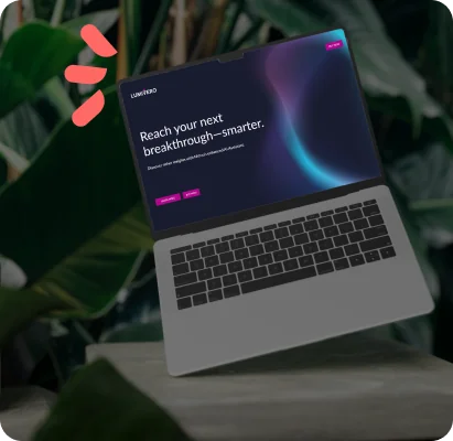
Provide a clear headline
Your headline is your first impression. Make it count. Tell visitors exactly what they’re getting and why it matters to them. A great headline delivers fast value, sets expectations and builds trust. If your headline doesn’t make someone want to click, it’s time to rethink it. When people instantly understand the benefit, they’re more likely to act.
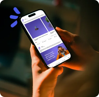
Take this example from a recent Accelity project we had the pleasure of creating: we created a HubSpot landing page for LERETA’s LERETA University campaign. The site is a learning hub where customers can master LERETAnet and streamline their real estate tax servicing operations. LERETA wanted to upgrade the experience to better reflect their current brand and create a more user-friendly experience. The headline? It focused on the ultimate benefit of the page, making it immediately clear what users would gain.
In a small amount of space, this hero section included:
- A clear headline focused on value
- A subhead qualifying what the offer is
- A CTA button to learn more
- A hero image
Engaging headlines capture attention like that—fast, focused, and benefit-driven.
Additional copy is concise and scannable
Try this: take 10 seconds to evaluate your landing page (known as a “blink test”). If your copy doesn’t demonstrate the value of the offer in this time, your website visitors are likely coming to that conclusion as well.
Visitors won’t read every word—and they don’t need to. The goal is for them to understand the value of your offer with to-the-point bullet points, bolding, emojis (if they fit your brand) and whitespace to make the page easy to skim. Keep paragraphs short and focused. If your offer’s value isn’t obvious at a glance, your visitors will bounce.
Use visuals to support the message
As my creative writing teachers always said, “Show, don’t tell.” Visuals can demonstrate the value of your product, service or resource and build credibility. When used well, they increase conversion rates by helping page visitors connect emotionally with your desired end goal. That connection can be the tipping point between someone clicking away and someone converting.
Remember: When adding images, make sure the resolution is clear. When adding videos, try to keep them to 30 seconds or less (shorter is better). Pair visuals with concise copy for maximum impact.
Right-size your form
The length of your form should match the value of your offer. A short, actionable checklist? Ask for just the basics. A deep-dive whitepaper or webinar? You’ve earned the right to request a bit more info.
We’ve found that shorter, clearer forms generally convert better. But context matters: forms targeted to specific audiences can justify more fields if the offer is worth it.
Keep an eye on your landing page conversion rates. If downloads are high, test by asking for additional information. If conversions are low, try shortening the form. It’s all about finding the balance between quality leads and a frictionless experience.
Make the CTA button unmissable
Your CTA button shouldn’t just be visible—it should be irresistible. Guide your visitors’ eye toward a clear button that’s easy to click. On mobile, especially, make sure it’s tap-friendly. A hover effect can give users the confidence they’re clicking in the right spot.
Tips: button copy matters too. “Submit” feels cold and transactional. Instead, try action-oriented, benefit-focused phrases like “Get the guide,” “Claim my spot,” or “Start learning.” The more specific, the better. Personalized CTAs perform 202% better, a study of 330,000 CTAs over six months found that personalization, like showing different buttons to different audiences, dramatically improves conversion rates.
If you’re using a platform like HubSpot, smart CTAs are a great way to implement this.
Keep content above the fold
Don’t bury the good stuff. All key information—your offer, your headline, your CTA—should be visible without scrolling. This gives visitors immediate clarity and minimizes friction. The faster someone understands your offer, the more likely they are to convert.
Scrolling delays decision-making. If a user has to dig to find value, they’re more likely to leave. Keep the essentials up top and easy to access.
When in doubt, test everything
Even with best practices in place, there’s no one-size-fits-all approach. Test headlines, button text, form fields and images. Small changes can make a big impact on conversion rates.
Want to turn more clicks into conversions?
Whether you’re optimizing an existing page or building from scratch, we’ve got your back. Let’s build something that converts.
Subscribe to our newsletter
Curated content, news articles, team updates and more.