A bold event strategy that created buzz, built momentum and drove real pipeline results
No matter the industry, every exhibitor walks into a conference with the same hope: stand out.
With limited time, hundreds of competing booths and a room full of prospects you may never see in one place again, the pressure is real. Planning for a major event takes coordination, creativity and a team that can keep everything moving when the conference floor gets chaotic.
CLARA Analytics came into Insuretech Connect Vegas 2024 facing that challenge, but also saw a clear opportunity. They’re a trailblazer in AI-driven claims intelligence, helping carriers make faster, more accurate decisions long before “AI” became a buzzword. Their technology evaluates risk, identifies patterns and surfaces insights that claims adjusters can act on.
At an event built on innovation, CLARA needed an experience that truly felt fresh.
As the industry’s interest in AI skyrocketed, CLARA needed a conference presence that matched their momentum: bold, memorable and aligned with the sophistication of their platform. That’s where Accelity stepped in, turning their goals into an experience that not only drew attention but also drove meaningful connections and measurable results.
The spark: A familiar court, a bolder play
CLARA wasn’t new to ITC or conferences in general, and they always aimed to make a splash.
But this year, ITC felt different. With AI dominating every stage and exhibitor panel, they knew the room would be louder, flashier and more competitive than ever, and they didn’t want to blend into the background.
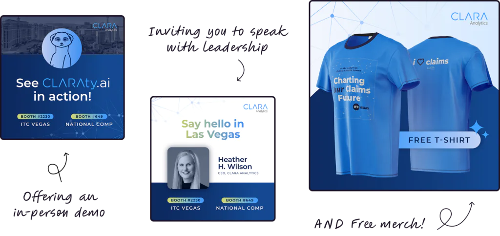
They wanted a presence that matched the strength of their product and the leadership position they’ve earned as early pioneers of AI in insurance. That meant drawing more people in, creating a booth experience worth talking about and building real momentum around their pre-event Summit Day.
The shift: A strategy designed to create buzz, not just booth traffic
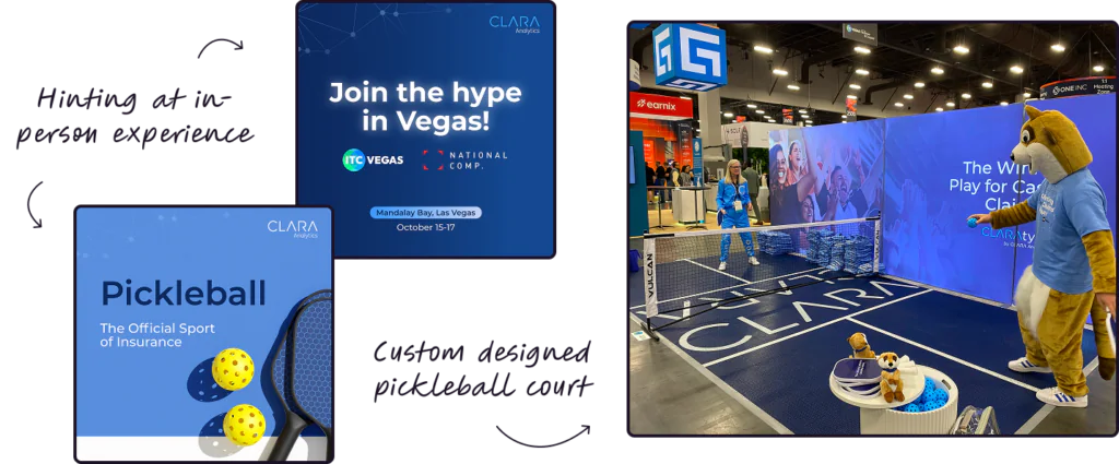
CLARA came into the planning phase with a spark of inspiration from their CMO: pickleball. It was timely, playful and instantly recognizable, a perfect starting point for a brand ready to show up differently. Our job was to take that seed of an idea and build an event strategy bold enough to match it.
Together, we shaped a plan that went far beyond surface-level fun. The strategy focused on creating real talkability—the kind of presence people would seek out, photograph, share and remember.
At a conference as fast-moving as ITC, we knew CLARA needed more than booth traffic. They needed energy. Momentum. A booth that attendees would want to come back to.
So while the pickleball concept gave us a strong foundation, Accelity turned it into a full event identity. We created a “join the hype” theme that aligned pre-event promotion, Summit Day messaging and the onsite experience into one cohesive, high-impact story.
It was the shift CLARA needed; not just to stand out, but to show up with personality and confidence in a way their audience would instantly connect with.
The build: Turning a bold concept into a full-court experience
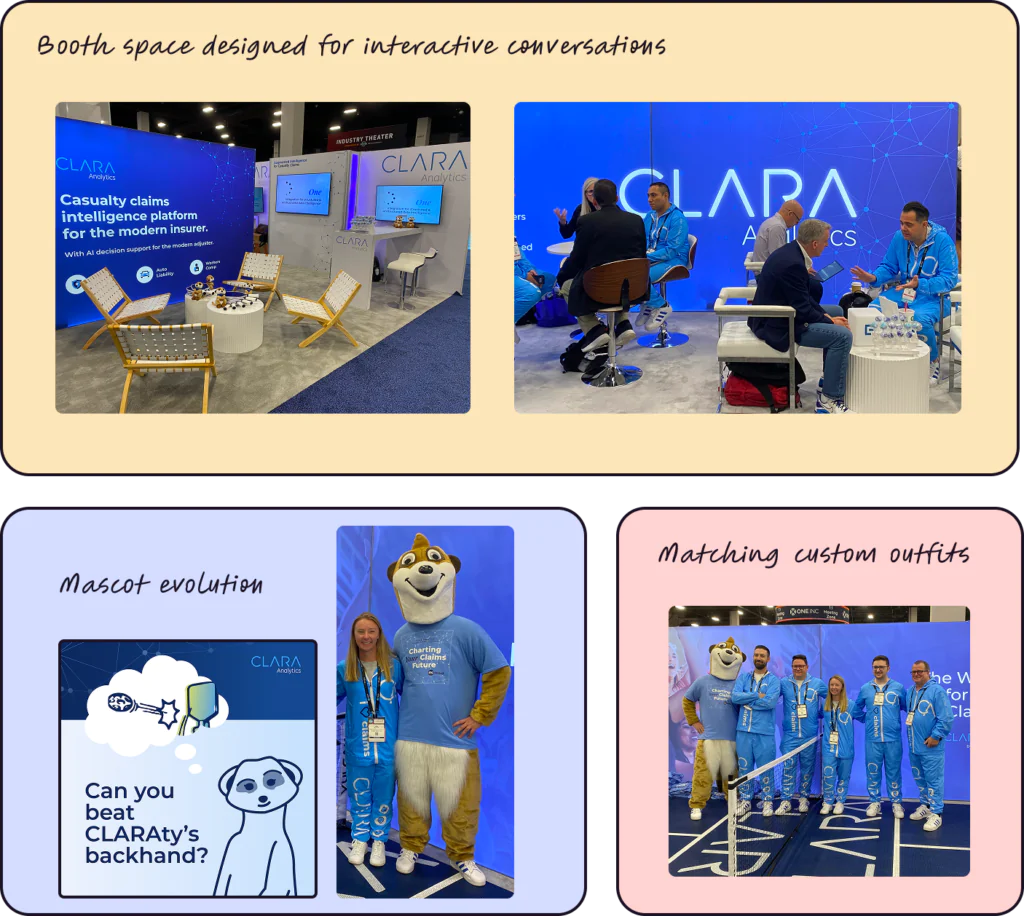
Once the strategy was locked, our focus shifted to creating every element of the pickleball activation so it felt intentional, polished and unmistakably CLARA. The concept was playful by nature, but the execution needed to reflect the sophistication of the brand behind it.
Accelity built the full activation, including:
Booth design, featuring a playable pickleball court and a stadium-style backdrop that made the space energetic and immersive
Creative assets for signage, Summit Day materials and in-booth branding
Pre-event LinkedIn ads and social content to warm up target accounts and drive Summit registrations
Email support to build anticipation and guide people toward key conversions
Mascot planning, including handling logistics for CLARAty the Meerkat’s appearances
Coordinating team outfits, including the now-famous tracksuits that became a conference-wide conversation starter
Everything was built to reinforce one cohesive story: CLARA is confident, approachable and ready to lead the next chapter of AI in insurance.
The launch: Serving energy, excitement and nonstop momentum
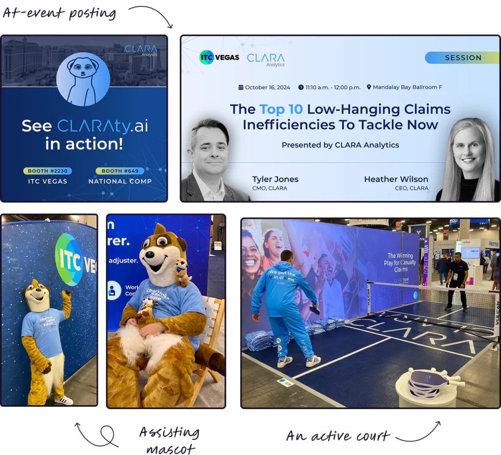
With the build complete, Accelity joined CLARA in Las Vegas to bring the experience to life. Their dedicated account manager, Sarah, led the activation on the ground, keeping the booth running smoothly, fielding last-minute adjustments and making sure every detail stayed aligned with the strategy.
On-site, Accelity handled:
Summit Day setup and coordination
Booth management, including traffic flow, organization and ongoing resets
Live LinkedIn posting to amplify activity and keep CLARA visible throughout the conference
Photography and content capture for post-event follow-up and brand storytelling
Mascot support, ensuring CLARAty stayed active, engaging and safely managed
Real-time troubleshooting so the CLARA team could stay focused on high-quality conversations.
The booth quickly became one of the most talked-about spots at ITC. Attendees stopped for a game, stayed for a conversation and often returned with colleagues eager to “see the pickleball booth” for themselves.
The impact: A rally that paid off
The results reflected the energy on the floor.
CLARA’s pre-event LinkedIn ads generated strong interest with 104,759 impressions and more than 1,000 website visits, keeping the brand top of mind before attendees ever arrived in Las Vegas.
All that buzz translated directly into stronger conversations. Their pre-event Summit drew more than 300 attendees, creating a high-quality environment for education and early engagement. During the conference, an estimated 600 attendees visited the booth, and CLARA added 81 new contacts and uncovered 19 new opportunities, representing an estimated $6.1 million in gross pipeline.
This event wasn’t an isolated win. The year before, CLARA generated $3 million in revenue tied to ITC efforts supported by Accelity, proof that strategic, creative event marketing can have meaningful, long-term impact. Even the tracksuits had staying power. During ITC 2025, attendees were still bringing them up!
1,000+ website visits
ahead of conference
81 new contacts added
with 19 new opportunities
$6.1m in gross pipeline
from ITC marketing & sales efforts
A partnership built on bold ideas and practical execution
CLARA came into ITC ready to make a statement. Our job was to turn that ambition into something real, something people could see, feel and remember.
Together, we built an experience that didn’t just stand out. It brought people in, sparked conversation, created momentum and turned a busy conference into a meaningful driver of business growth.
If your next event needs more than a booth—if it needs a moment—let’s build it together.
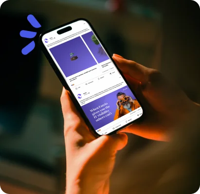
How we turned brand momentum into a scalable, multi-channel story.
When your brand starts gaining traction, the pressure builds fast: don’t lose it, don’t stall it, don’t waste it.
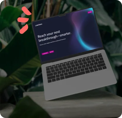
About AtlasFX
AtlasFX helps global companies manage FX and commodity risk with a powerful platform built by founders with decades of real-world experience.
For any business that buys, sells, or operates across borders, currency swings and commodity price moves can quietly erode margins long before anyone sees them on a P&L. Managing that exposure—known as FX (foreign exchange) and commodity risk management—means anticipating where those costs could move and putting protections in place before they do. It’s technical, high-stakes work, and most companies handle it with a patchwork of spreadsheets and disconnected tools. AtlasFX replaces that patchwork with a single end-to-end platform.
Digging into the work: A complex story that needed clarity
Over the course of our partnership, we worked closely with the AtlasFX team to strengthen how their expertise showed up in the market — through a rebrand, a new website and an increasingly confident digital presence. So when it came time to kick off the next digital marketing campaign, AtlasFX wasn’t starting from zero. The groundwork was laid, and the focus shifted from building momentum to sustaining it.
Momentum doesn’t sustain itself. It needs structure, clarity and a plan to scale.
Because we’d already been working together, we had plenty of performance data to review — a clear read on how content was landing and how audiences were responding. The question for the campaign became simple: how do we keep a good thing going and capitalize on the momentum?
The answer started with zooming out before moving forward. As the only end-to-end FX risk management solution on the market, AtlasFX brings a level of specialization competitors can’t match — and that story can’t be told in a single email. The audience needed clearer education on the solution, and AtlasFX needed content that made their value obvious at a glance.
So we aligned on the role marketing needed to play next: how the story should land, how it should build trust, and how it could support growth over time. From there we shaped a plan centered on education, credibility and scale — a system that could sustain and scale what was already working, deepen audience understanding, reinforce differentiation, and give AtlasFX a repeatable way to show up confidently across every channel.
Targeted optimizations across email, LinkedIn and paid search are proving that stronger audience focus drives better engagement and lead quality. Continued testing and optimization will be key to sustaining this momentum.
The shift: Creating the right tools to tell a clearer story
To help AtlasFX communicate with confidence, we built two cornerstone assets designed to simplify the message and strengthen how the brand showed up in the market.
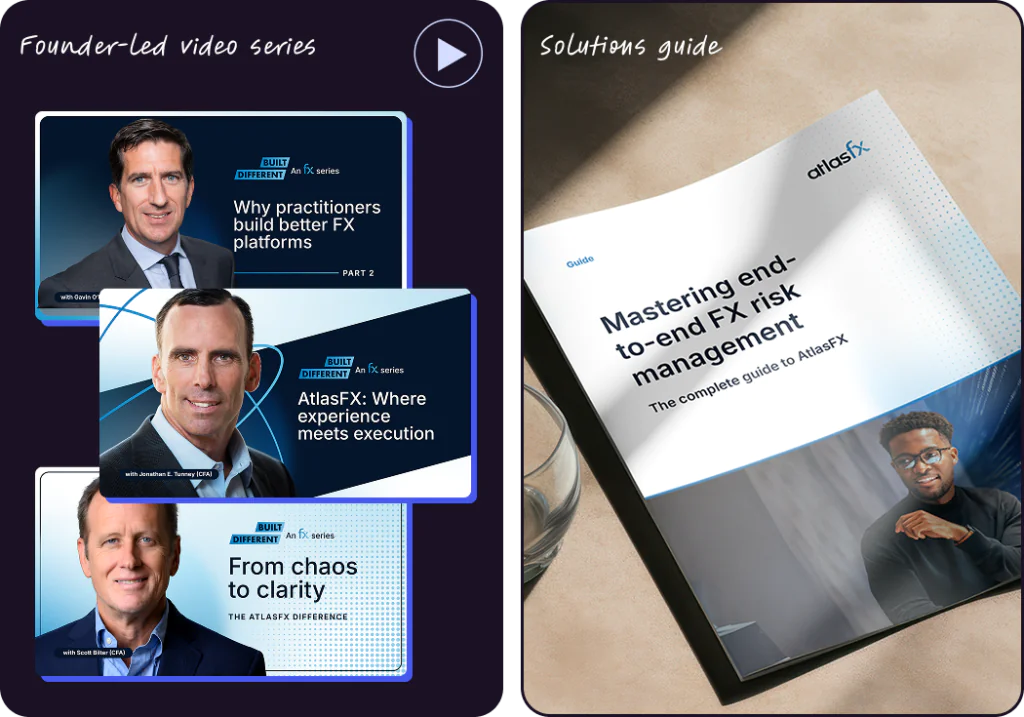
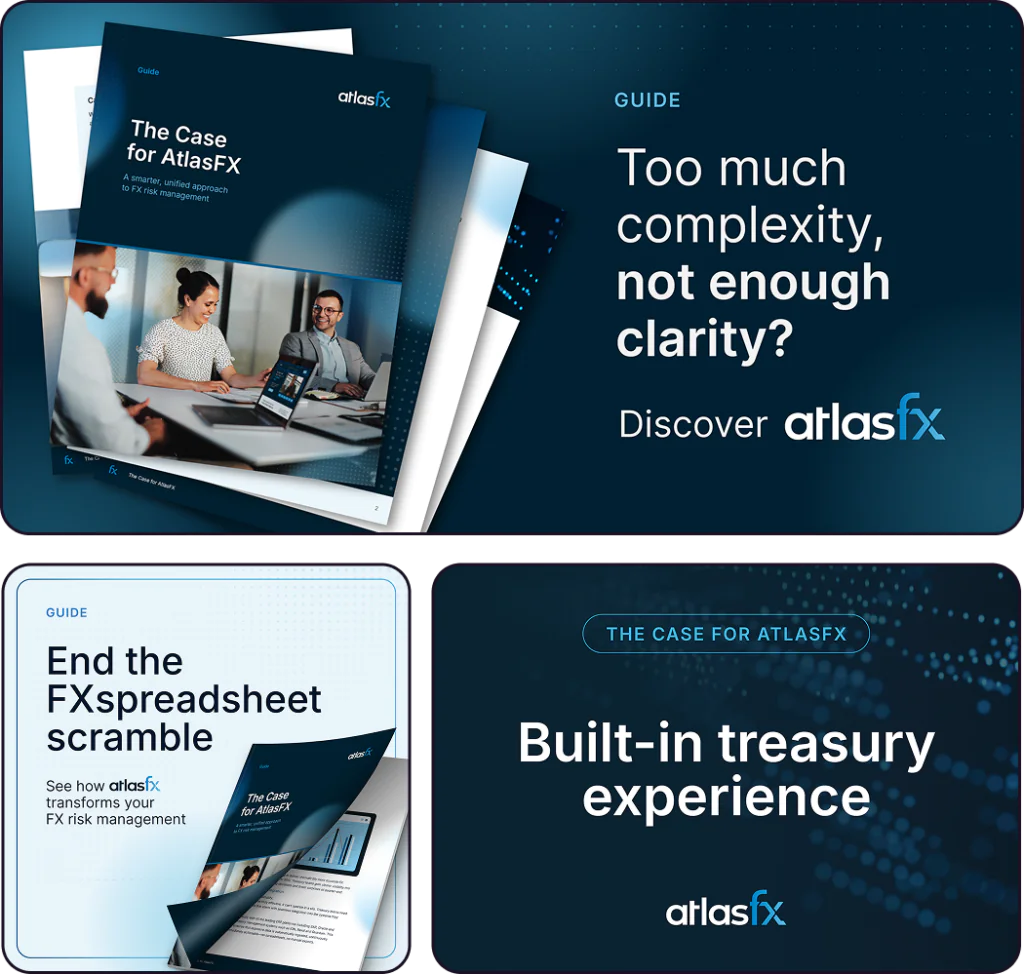
1. A comprehensive flagship guide
We created a guide that distilled a complex offering into a cohesive, accessible narrative.
The guide, The Case for AtlasFX, delivered on a few key fronts:
It made the platform much easier to understand by taking technical jargon and putting it into plain English.
It gave the sales and marketing teams a consistent, shared story to use every time they talked to a prospect.
It clearly showed why AtlasFX is the best choice, especially in a crowded landscape.
This became the foundation for AtlasFX’s entire go‑to‑market message and a tool the team could use well beyond the campaign.
2. Founder-led video series
We produced unscripted conversations with AtlasFX’s three co-founders that put authenticity and expertise front and center.
Together, these assets made the AtlasFX story easier to tell, and easier for prospects to understand.
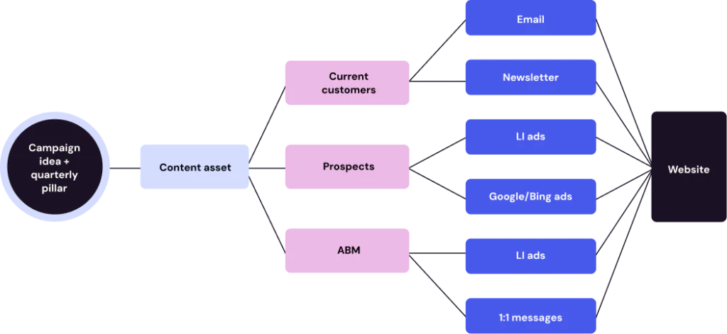
The build: A cohesive campaign that worked across channels
Once the core story was clear, we scaled it across every major marketing channel to ensure consistency and impact.
LinkedIn Ads
We built three ad streams, each promoting the videos, the guide or the LinkedIn articles, to engage audiences at different stages of the buyer journey. Each variation reinforced the same core message.
LinkedIn organic
By repurposing that ad content into a steady organic cadence, we increased visibility without adding unnecessary hours for the client.
Google Display retargeting
We adapted the guide creative for remarketing, reinforcing message recall and guiding returning users toward conversion.
Email workflow
A six‑email nurture sequence used the new narrative to efficiently move prospects from awareness to understanding.
Search & SEO
Our updates to search strategy, competitor targeting and internal linking helped more qualified traffic discover AtlasFX.
YouTube distribution
YouTube played a key role in extending the life and reach of the video series. AtlasFX published full‑length founder videos to build long‑term discoverability, leveraging YouTube’s algorithm to reach viewers actively researching FX risk management.
Across every channel, Accelity ensured the message stayed consistent, clear and compelling.
What kept us aligned (and moving quickly)
A single messaging framework
Clear middle → bottom-of-the-funnel pathways
Consistency across email, ads and video
One anchor piece (the guide) that guided all marketing assets
Repurposable content mapped out before creative began
A testing plan for audiences, placements and messaging
We didn’t just build assets. We built a system that worked together.
The launch: A marketing engine built to work long after go‑live
When the campaign launched, the biggest shift wasn’t just better content; it was better alignment. AtlasFX had a message that worked across channels, teams and touchpoints.
Accelity’s work helped the AtlasFX team:
Share a unified story across sales and marketing
Streamline follow‑up conversations with assets that did the heavy lifting
Build trust earlier through a cohesive narrative and human‑centered content
Reduce confusion in the market by explaining their value clearly and consistently
Instead of piecemeal assets, they now had a full campaign ecosystem designed to grow with them.
The impact: How momentum turned into measurable growth
The true measure of a strong digital campaign isn’t just what happens at launch, it’s what keeps happening after. As the assets rolled out across channels, AtlasFX saw momentum turn into tangible, sustained growth.
The campaign quickly became one of the highest-performing initiatives on the site. The guide landing page drew strong traffic and became a primary entry point for prospects, meaning potential customers were arriving exactly where they should. As that traffic grew, so did meaningful action — site form submissions climbed sharply and kept climbing into the following month, a shift in how prospects interacted with the brand rather than a one-time spike.
The founder-led video series became one of AtlasFX’s strongest awareness tools, earning significant reach on both YouTube and LinkedIn, while the cross-channel paid program turned impressions into direct conversions. Underneath it all, a steady stream of the right prospect companies engaged with AtlasFX content throughout the campaign’s initial run.
The impact in numbers
3,700+ views on the guide landing page across September and October—the second most-trafficked page on the entire site during that window
300% increase in site form submissions in the campaign’s first 30 days, then another 42% the following month
56,000+ YouTube views across the original 11 Master of One videos
19,000+ impressions and 443 clicks from LinkedIn video ads, plus 14,000+ impressions and 433 clicks from LinkedIn ads overall
100,000+ Google Display impressions at a 4.25% CTR, driving 64 direct conversions
83 prospect companies engaged with AtlasFX content from June through November 2025, many through Master of One assets
The pattern underneath these numbers matters more than any single figure: traffic arrived at the right entry point, converted at a rising rate, and pulled the right companies deeper into the buyer journey. That’s not a launch spike — it’s a system working.
AtlasFX didn’t just get more eyes on their brand, they got more of the right eyes, taking meaningful steps forward in the buyer journey.
83 key companies
influenced by our marketing in 5 months post-campaign launch
300% increase in site form submissions
in the first month of the campaign
100k+ impressions, 4.25% CTR and 64 conversions
from Google Display ads
Discover the power of clear, confident digital marketing
This campaign wasn’t about features or functionality. It was about helping AtlasFX communicate the value they’ve always had through a message built to convert, a story built to scale and assets built to work long term.
“Thank you so much to you and the team for making this so incredibly painless and easy, from the story outlines to cutdowns to the folder with everything. Everyone is really happy with these videos and the process was so smooth and feedback so minimal. The creative looks great.”
Rich Turgeon, Creative Director
That’s the power of strategic marketing done well: it turns complexity into clarity, expertise into confidence and potential into momentum.
If you’re ready for marketing that tells your story clearly and moves your business forward, we’d love to help.
For more than a decade, Accelity has helped growing companies find their story and build brands that feel like them, so when our own site stopped feeling like us, we knew exactly what that meant.
The short version
The challenge: After a decade of growth, our website still reflected an earlier version of Accelity—flat branding, missing service areas (brand, web design), and a B2B-SaaS-only focus we’d outgrown.
What we did: A full rebuild in roughly six months—a ruthless content audit, a reusable component-driven design system, structured copy and SEO foundations, and a CMS the team can run in-house.
The results: +131% average session duration, a 58.67% engagement rate (above the marketing & advertising benchmark), and a 649% spike in launch-day traffic over forecast.
This story’s a little different… because this time, we were the client.
After years of helping growing companies find their story and build brands that feel like them, our own site stopped feeling like Accelity. It still worked, just not for who we’d become.
So we did what we ask our clients to do: got uncomfortable, turned the mirror inward, and walked ourselves through the full process, from the first what-if to the final push before launch.
We build brands that show companies who they are. This time, it was our turn.
The spark: When the brand outgrew the site
An idea that kept coming back
It started during our 2023 summer town hall meeting—an idea that kept showing back up: “What if we rebranded?”
At first, it felt like one of those “someday” ideas. But it came up again and again, across departments and conversations. We’d been growing fast, doing bold work and launching brands we were proud of. Yet every time we looked at our own website, it looked like the agency we used to be, not the one we’d become.
By the start of the next year, it was impossible to ignore. Our brand had moved forward, but its digital representation had stayed behind.
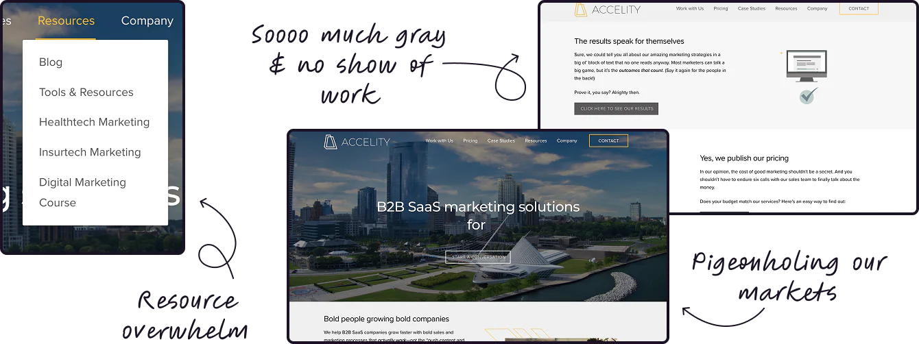
The signs we’d outgrown it
After tackling an internal rebrand, we took a hard look at our site. That bright yellow that once screamed energy? It had started to feel flat. It reminded us of where we’d been, not where we were going. And while the site covered some of our services, it didn’t showcase the newer areas—like our brand work and website design and development—where we’d built a strong portfolio. We were also ready to expand beyond the B2B SaaS space where we’d gotten our start.
Practicing what we preach
And, like a lot of agencies, we’d slipped into a cycle of not taking care of our own marketing. As our CEO Jackie put it:
“Agencies are often the cobbler’s kids with no shoes—we’re always doing the work for other people, and then it’s hard to continually do the work for yourselves.”
That was the turning point. We realized our brand deserved the same creativity, strategy and attention to detail we pour into every client project. So we turned the spotlight on ourselves and got to work.
The shift: What it took to build a site that finally fits
From the beginning, this project was about more than a new look; it was about building a site that could grow with us.
Our goals were clear: make the site easier to navigate, faster to update and more aligned with how visitors actually explore our work. We wanted a modular system our team could manage in-house, content structured for both humans and search engines, and a foundation that performs as well as the websites we create for clients.
Content audit with ruthless editing
Ten years of pages went on the table. We cut what didn’t serve the journey, merged duplicates and rewrote thin content so every page earned its place.
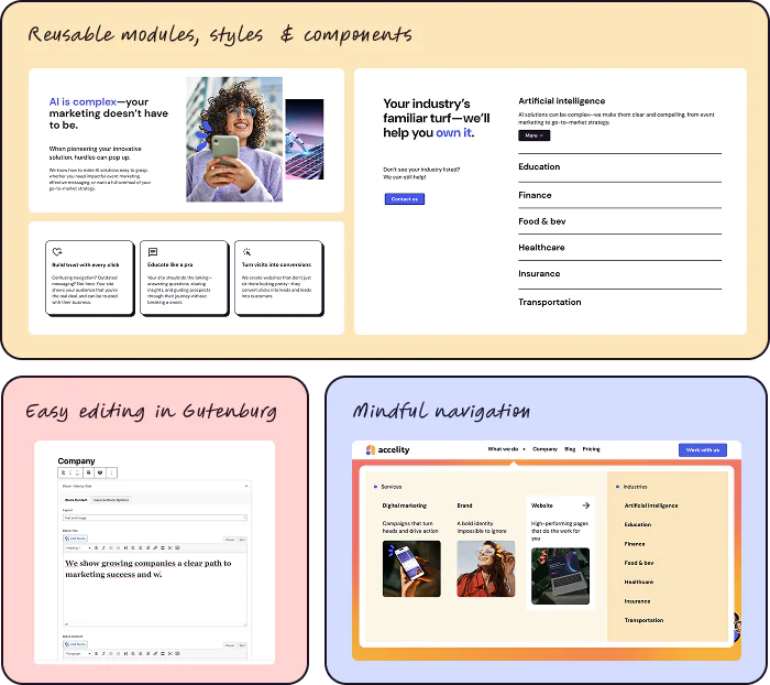
Component-driven design system
Before designing full-page mocks, we built a component-driven design system (a reusable library of pre-built page parts—cards, hero blocks, CTAs, testimonial modules) that the team assembles into pages instead of designing each one from scratch. It meant fewer one-offs, faster builds and cleaner QA.
Structured copy + SEO from the start
Each template shipped with field-level guidance for H1s, intros, scannable subheads, FAQs and internal links. We mapped target terms to pages to avoid cannibalization and set up schema and search foundations (structured data that labels page content like authors, dates, and FAQs so search engines and AI tools read it accurately) where it mattered.
Accessibility and performance baked in
Color contrast, focus states, motion preferences and image optimization were all handled up front. The site is as fast and inclusive as it is good-looking.
A CMS the team actually wants to use
Global styles, locked spacing and plain-language fields keep the brand consistent while making edits quick and low-stress for anyone on the team.
A quick note on brand: Yes, the refreshed look needed to apply cleanly to the site, but the priority was function. The system above makes the brand easier to build upon, allowing function and brand to coexist in harmony.
The build: Testing our own website process
Building our own site while prioritizing client work and testing new tools and processes was, honestly, the hardest project we took on that year. We followed our process… then broke it where we had to.
Between client launches and a packed event season, we moved from rebrand to live site in roughly six months, a sprint that reminded us what it’s like to be in our clients’ shoes.
We learned a lot along the way, lessons that now make our client website work even stronger:
Make the vision tangible early. Real-world mockups (social posts, key screens, headlines) build alignment faster than a logo and palette alone.
Lock the website style sheet up front. We have to document buttons, cards, grid, motion, interactive states early to avoid rework later.
Wireframe as a team sport. Design and copy plan structure together so messaging and UI land in the same conversation
Plan for real-life resourcing. Building our own site showed us what it feels like when priorities compete. That experience made us even better at helping clients balance timelines, budgets and goals.
We learned what it feelslike to be in it—where clients get overwhelmed, and where small changes feel big. That empathy elevated how we work.
When the site went live, it felt like an exhale—the kind that only happens when something long in the making finally clicks.
We’d spent weeks building anticipation, starting with a New Year’s teaser that hinted something big was coming. Over the next few weeks, we dropped glimpses of our refreshed brand and design direction, each one sparking more curiosity and excitement. By launch day, clients, partners and friends were more than excited to see what we’d built for ourselves.
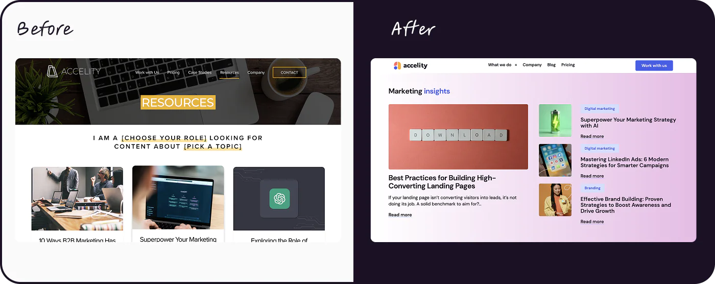
The new site didn’t disappoint. The colors pop. The layout breathes. The copy sounds like us: direct, cheery and helpful.
Rave reviews
The response was immediate and overwhelming. We got rave reviews across the board. Clients we already work with asked for similar treatment. Prospects reached out about their own brand and web projects.
The new site doesn’t just look good, it works. Our new brand and website have opened doors, deepened relationships and given the team something we could point to and say, “Yep, that’s us.” (Meet the team behind it.)
A work in progress (by design)
Like every site we build, ours isn’t “done.” And that’s exactly how it should be.
Since launch, the site has continued to evolve. We’ve tuned accessibility, adjusted motion, and expanded pages that deserve more depth, like our services and industry sections. Six months in, we launched our blog to give our content a true home base.
As we’ve lived in the new brand, we’ve made copy and design tweaks to reflect what we’ve learned about how it performs in the real world.
Now, our focus is on iteration and optimization. We’re monitoring analytics and SEO performance to identify opportunities to improve conversions and visibility, and we’re adapting the site to meet new generative engine optimization (GEO) standards, the practice of structuring content to be found in AI search, so it’s discoverable in both search and AI-driven results.
Because that’s what good websites do: they grow, adapt and evolve right alongside the brand.
2m 39s
avg. session duration (3 months post-launch) +131% vs. previous period
58.67%
Median engagement rate Beats industry benchmark for Marketing & Advertising Agency (~53.76%)
1,149
page views on launch day A 649% spike over GA4’s expected 153
Source: Accelity Google Analytics 4
Show the world what you can do
Our new site did more than tell our story; it reminded us what we’re capable of. And it brought new business through the door.
Now, let’s build a website that does the same for you.