

Websites are key to any successful business’s online strategy. Almost every business—whether B2B, B2C, non-profit, local or global—needs an online presence to reach buyers in this digital age. The necessity of websites is clear, but what’s shocking is that 27% of small businesses still don’t have one. Even if you’re active on social media, operating without a website means far less visibility; it’s an essential piece of your marketing strategy and is often referred to as your brand’s digital storefront.
Whether you’re building your first site or optimizing an existing one, the goal is the same: create a strategy that makes your website work for you.
Having a website alone isn’t the key to great results. It needs to:
- Attract
- Educate
- Move visitors through the buyer’s journey
This is easier said than done. While websites were once static and cluttered with outdated features like Flash animation, today’s web demands fast, mobile-friendly, accessible design that integrates with search, content and social media.
Additionally, as search evolves, it’s no longer just about ranking on Google. Generative AI tools like ChatGPT, Perplexity and Google’s AI Overviews are reshaping how users find and engage with information. That’s why a new layer of optimization—generative engine optimization (GEO)—is becoming just as critical as traditional SEO. GEO helps your content appear in AI-generated answers by focusing on clarity, authority, and helpful context rather than keyword repetition.
That shift is driven by changing buyer behavior. Today’s customer prefers to self-educate, often long before they talk to a salesperson. Marketing content like podcasts, blogs and social media now play a critical role in the buying cycle.
Ultimately, your website is the hub where those channels converge. Traffic from blogs, organic and paid search and social platforms typically converts into leads or sales here. Without a website acting as an online basecamp, it would be difficult to attract new business to one main source. That’s why building an effective conversion-ready site is so crucial.
A great website is possible—and it starts with strategy. In this guide, we’ll cover everything you need to build a conversion-ready site, from getting found online with SEO and GEO to creating compelling content and seamless user experiences that drive results.
Part One: Get found online
You can have a great, user-friendly website with appealing design, but that doesn’t matter if no one visits it. For that reason, the first part of this guide is dedicated to getting found online—an activity that occurs at the top of the funnel of your inbound marketing strategy. Search engine optimization (SEO) is an absolute must-have for any website strategy, but it takes hard work and consistency when aiming for top rankings.
These tips will help get you on your way to increasing your organic (non-paid) search engine visibility.
1. Building inbound links
Every website on the internet wants to reach the top position in search engines, but because there’s only one top spot per keyword phrase, not everyone gets there or is even on the first page. So how can you improve your chances?
Off-page search engine optimization (SEO) is one of the most important factors for increasing your ranking results.
Off-page SEO is about building inbound links: essentially getting other quality websites to link back to you. Search engines call this authority, or “link juice.” The more inbound links you have, the more important your site appears to be, and the higher you’ll rank.
Link building, when done right, isn’t easy, since adding links to other websites is often out of your control.
Here are some useful tips to build inbound links:
- Create high-quality, educational or entertaining content. If people like your content, they will naturally want to link to it
- Write guest posts for other blogs. This is a win-win—people want extra (quality) content, and in exchange, it’s a great way to build inbound links
- Research link-building opportunities with other websites, but always check the authority of the websites you’re trying to get links from. Tools like Moz’s Link Explorer, Ahrefs or HubSpot’s Website Grader can help
- Collaborate with partners and clients to create co-marketing content or case studies that naturally earn backlinks
- Never borrow, beg, barter, bribe or buy links
2. On-page search engine optimization (SEO)
While off-page SEO is hugely important, don’t forget about on-page SEO. This consists of placing your most important keywords within the content elements of your actual pages. These elements include:
- Headlines
- Sub-headlines
- Body content
- Image tags
- Links
On-page SEO is sometimes referred to as “keyword density.” Before we post any blog to the Accelity website, we execute keyword research to ensure that our content includes relevant search terms.
It’s very common for businesses to do too little on-page optimization—or too much (keyword stuffing). While it’s important to include your keyword where necessary, don’t go overboard.
Tips for doing on-page SEO right:
- Pick a primary keyword for each page and optimize that page for it. Don’t oversaturate with too many keywords; the page will lose its importance and authority because search engines won’t have a clear idea of what the page is about. This is very common on homepages in particular, where too many keywords are used
- Place your primary keywords in the headline and sub-headline. These areas carry more weight with search engines
- Include the keywords in your body content, but use them in context
- Add keywords in image filenames (e.g., mykeyword.jpg) and ALT tags
- Use keywords in the page URL and keep the URL clean
- And most importantly: write for humans first, search engines second. Always prepare your content for your audience and then look to optimize it for search. Content written in the other order won’t read naturally and your visitors will notice and recognize it
Modern SEO also favors fast-loading, mobile-optimized pages. Clean structure, accessibility and relevance matter just as much as keywords.
3. Title tag & meta tags
While this may be the least sexy component of SEO, it is a definite must-have. A meta tag is a line of code that lives in the background of a webpage. Search engines use meta tags to learn what the page is about.
Meta tags don’t carry the same SEO weight they once did, but they’re still important—particularly the title and description. Years ago, websites overused keyword stuffing in meta tags, but search engines are now much smarter and prioritize high-quality content and inbound links.
Meta keywords no longer impact rankings and should be skipped altogether. Focus instead on a strong meta description that improves click-through rate.
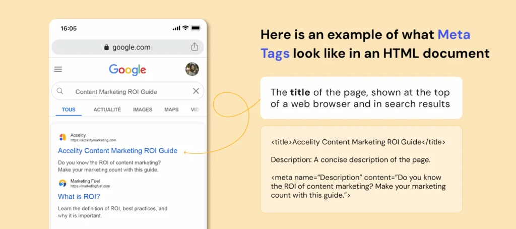
Here is an example of what meta tags look like in an HTML document
Title: The title of the page, shown at the top of a web browser and in search results
<title>Accelity Content Marketing ROI Guide</title>
Description: A concise description of the page.
<meta name=”Description” content=”Do you know the ROI of content
marketing? Make your marketing count with this guide.”>
If you’re working with a CMS like WordPress, Squarespace or HubSpot, you can typically edit title and meta description tags directly in the page editor or SEO settings—no coding required.
4. Keywords
Keywords still matter—but only when used strategically.
By now, you’ve seen where keywords should live: headlines, sub-headlines, body copy, image ALT tags and URLs. These placements help search engines understand what your content is about—without overloading the page. As a rule of thumb, keep each page focused on a small number of keywords—ideally six or fewer—to ensure relevance and readability.
Note: Meta keywords are no longer used by Google or other major search engines, so you can skip those entirely.
5. XML sitemaps
An XML sitemap helps search engine crawlers (or “spiders”) efficiently navigate your site. It’s basically a map of all your pages and when they were last updated—helping Google and other engines index your content faster and more accurately.
You can still use sitemap generators to create this file manually, but most CMS platforms like WordPress, HubSpot and Squarespace now generate and update your sitemap automatically. Manual updates are rarely necessary.
To check your sitemap, try accessing www.[yourwebsite].com/sitemap.xml. If it’s there, you’re set.
6. 301 Redirects
We’ve all landed on a broken link before—usually met with a “404: Page Not Found.” Often this happens when a page is moved or deleted without a redirect in place. Think about the lost opportunity here! Your customers or potential buyers want information that they can no longer locate.
To avoid this, use a 301 redirect, which permanently points the old URL to the new one.
301 redirects help:
- Preserve the SEO value of the original page
- Prevent user frustration and lost traffic
- Ensure a smooth user experience when content is moved or restructured
Without proper redirects, you could lose traffic, leads and valuable search rankings.
Getting found is the first step—but traffic alone won’t win you customers. In Part 2, we’ll dive into design and usability must-haves that keep visitors engaged once they land on your site.
7. Generative engine optimization (GEO)
You’ve already seen how traditional SEO helps your site get discovered by search engines, but now, AI engines have joined the mix. Generative engine optimization builds on your SEO foundation, helping your content get recognized, summarized, and cited in AI-generated results.
To make your content GEO-ready, focus on clarity, completeness, and context:
- Write clearly and conversationally. Prioritize natural, human language that reads like a helpful explanation and not a keyword list.
- Use question-based headings. Structure H2s and H3s around queries your audience actually asks (e.g., “How do I optimize for generative AI search?”).
- Summarize key points. End sections with short takeaways or bulleted recaps that AI tools can easily extract.
- Add structure and signals. Schema markup, consistent headings, and clear author bios help AI engines understand your expertise and intent.
- Prioritize authority and accuracy. Cite reputable sources, link to related pages, and make your publication dates visible.
- Keep your site technically sound. Fast load speeds, clean code, and open metadata make it easier for both search and AI to crawl your content.
- Refresh often. Update older posts with new insights and data—AI engines weigh freshness heavily.
- Repurpose strategically. Create complementary formats like FAQs, visuals, and transcripts to make your content easier for AI to parse and reference.
Note: GEO isn’t replacing SEO—it’s an extra layer of discoverability that ensures your site stays visible as search technology evolves.
Part Two: Design & Usability
Now that you’re generating traffic, your next focus is keeping those visitors engaged once they arrive. It depends on the industry, but most websites have a 30–60% bounce rate. That means a large majority of web traffic (often landing on your homepage) leaves without clicking to another page—and many of those visitors may never return.
Yikes, right? That’s why design and usability are so critical. In this section, we’ll share tips to make a strong first impression, improve user experience, and decrease bounce rates so visitors stick around.
8. The first impression
Your website represents who you are and what you have to offer. When people visit for the first time, they’re thinking:
- Is this site credible?
- Is it trustworthy?
- Is this a professional company?
- Is this company stable?
- Does this site make me feel welcome?
- Am I in the right place?
You need to ask yourself all of these questions when designing your website. Design may not be the most important factor for a website, but it does play an important role in making a good first impression.
For example, an in-depth study from Stanford University and Consumer Web Watch found that a website’s design was more important than credibility indicators like privacy policies or certifications. P-44 Technologies does a great job at summarizing this study, saying, “Visitors first evaluate a site’s overall design, including its use of multimedia.”
Fortunately, design doesn’t need to be flashy—it needs to support your content. A visually strong website earns a second look. A cluttered, dated or confusing site? That bounce rate is going up.
As Beau Brendler of Consumer Web Watch noted, “While consumers say they judge on substance, these studies demonstrate that consumers judge on aesthetics and get distracted by bells and whistles.”
9. Website design
Once visitors land on your site, how it looks and feels matters. Your design should be visually appealing, easy to navigate and built to support—not distract from—your content.
Tips for a great website design:
- Use brand-aligned colors that draw attention to key content—without overloading the page. As a best practice, pick two to four colors for your template and marketing materials
- Avoid unnecessary gadgets, background audio or outdated animations. Only use media and animations to support your message
- Organize your content using a grid-based layout to create clarity and consistency
- Typography matters—use legible fonts, bulleted lists, headers and short paragraphs. If your site is in English, ensure information flows left to right and top to bottom
- Let your content breathe. White space isn’t wasted space—it helps guide the eye
Your design should also prioritize mobile-first formatting and fast performance. Users often visit from their phones, and Google now factors in mobile responsiveness and Core Web Vitals (like load speed and layout stability) when ranking pages.
While design is important, don’t forget that offering great content is what your visitors are ultimately after. A well-designed website might convince visitors to take a closer look, but they won’t look twice if the content isn’t useful or well organized. After all, you never get a second chance to make a first impression.
10. Maintain consistency
It’s best to keep design elements consistent from page to page. That includes colors, font sizes, layout and navigation placement. Visitors should be able to move through your site without reorienting themselves at every step.
Most sites benefit from three core layout templates: a homepage, a content page and a landing/form page. These can look different from each other, but should still feel cohesive across the experience.
When in doubt, simplify. Your visitors shouldn’t have to guess where they are or how to get back.
11. Using the right images
Images can be a powerful part of your website—but only if they’re used with purpose. Stock photos are easy to access and affordable, which makes them tempting. But generic images often come off as staged, irrelevant or even untrustworthy.
A 2023 study from CXL found that real photos of customers outperformed stock photos by 35% in conversion tests. The reasoning? Authentic visuals increase trust, improve recall and create stronger emotional connections.
CXL also notes that context matters. Photos should support your message, not just decorate the page. For example, if you sell a product, show it in use—not just floating on a white background. Selling a service? Show your team collaborating, not shaking hands in front of a stock skyline. This kind of contextual imagery brings copy to life, giving users visual cues that match what they’re reading and help them imagine the experience.
Here’s how to use imagery wisely:
- Avoid overused stock photos (reverse image tools like TinEye can help check where else a photo appears)
- Use real images of your team, customers or product whenever possible
- Match visuals to your message—every image sends a signal, whether you intend it or not
- If you must use stock, choose unique, high-quality visuals and customize them with overlays, cropping or brand elements to make them feel your own
Stock imagery isn’t inherently bad—but lazy image use is. Every photo you choose should support your message, reflect your brand and give users the visual context they need to trust what they see.
12. Navigation
Perhaps one of the biggest factors in keeping visitors on your site is simple, intuitive navigation. In fact, more than three-quarters of survey respondents in a HubSpot study said the most important website feature is “ease of finding information.” If it’s not easy to navigate your website, then consider some changes!
If people can’t find what they are looking for, they will give up and leave. Important factors in a site’s navigation are to:
- Keep your top navigation simple and visible across every page
- Add footer navigation as a backup
- Use breadcrumbs (except on the homepage) so visitors always know where they are
- Include links within your page copy and make it clear where those links lead—this is great for both usability and SEO
- Use a site-wide search feature
- Don’t overload the nav bar—less is more
- Don’t dig too deep—ideally no more than three levels deep
- Avoid using complicated JavaScript or any tech that can break on mobile
Clear navigation means visitors spend more time with your content—and more time moving through your buyer’s journey.
13. Accessibility
Accessibility isn’t just about browser compatibility anymore—it’s about creating an inclusive experience for every visitor.
To improve accessibility:
- Follow WCAG guidelines—this includes using proper heading structure, descriptive ALT text and ensuring keyboard navigation works
- Avoid low-contrast color combinations that are difficult to read
- Make all interactive elements (buttons, links, forms) easy to find and use
- Ensure screen readers can interpret your site’s structure and content correctly
- Use descriptive link text like “Download the guide” instead of “Click here”
A website that’s accessible to all users isn’t just more ethical—it’s better for search rankings and usability, too. A polished, user-friendly site earns attention—but it’s your content that wins trust. In Part 3, we’ll share content strategies that connect with your audience and inspire action.
Part Three: Content
Now, it’s time for the heart of your website: content. Your website content is what connects your audience to your brand—design and SEO might get them there, but content earns their trust, answers their questions, and turns visitors into confident buyers.
In this section, we’ll outline what great content looks like, how it should be structured, and what to avoid—plus how to create messaging, blogs, and resources that actually move people to act.
14. Messaging
There are four key questions your website should answer within seconds:
- What is this page about?
- Who is it for?
- What can I do here?
- Why should I choose this over another option?
Visitors should never have to guess. Your homepage and key pages should make the message immediately clear.
Here’s how to sharpen your messaging:
- Write clear, specific headlines that reflect your value—not vague taglines or filler
- Use subheadings to support your main point and lead the visitor through the page
- Include concise, direct calls-to-action with logical next steps
- Link within your copy to related pages and resources to help visitors explore
- Avoid industry clichés or buzzwords that dilute your message—clarity builds trust
- Test headline and CTA variations using A/B testing tools (like HubSpot or 5 Second Test) to see what drives action
A strong message makes it easy for visitors to understand your value and know exactly what to do next.
15. Educate and offer value
Even though your website exists to showcase your products or services, not every visitor is ready to buy the moment they arrive. You need to meet them where they are.
Second—remember, it’s not all about you. What’s in it for them?
To earn interest, keep your visitors’ needs front and center. Helpful, educational content builds trust and keeps people engaged as they move through the buyer’s journey.
Offer more than just product details. Provide eBooks, whitepapers, videos and other content that teach, explain or guide. Educational content not only nurtures prospects until they’re ready to buy—it also helps them feel like they’re learning, not being sold to.
When writing product-specific content:
- Speak directly to your audience using “you” and “we”
- Be transparent, conversational and human
- Use language they understand—speak their language
- Focus on how your product helps solve their problem
- Avoid phrases like “we’re the best”—let the benefits speak for themselves
Great content doesn’t just inform—it builds confidence, establishes credibility and leads people to act.
16. Importance of quality
Having a lot of content is good—but in a world where search engines are getting smarter and buyers are becoming more selective, quality content is what actually drives results.
Quality content is a must-have for any website. That means:
- Offer unique content—people (and search engines) notice originality
- Write for humans, not algorithms—robotic language loses attention fast
- Provide value—teach, explain or guide your audience
- Vet third-party writers—do your research before outsourcing content
- Keep your site fresh—outdated pages signal neglect
- Know your audience—the more specific the content, the more likely it is to convert
- Back up what you say—use credible sources for stats, quotes and claims
- Know your subject matter—accuracy is everything
High-quality content is also what AI search engines look for when generating responses. GEO rewards pages that are original, fact-checked, and easy to summarize.
Great content builds trust, keeps visitors engaged and makes your brand more memorable. Don’t just fill space—earn attention.
17. Avoid overused jargon
A polished, professional brand is important—but that doesn’t mean loading your site with empty buzzwords.
Corporate jargon refers to words and phrases that get overused to the point of meaninglessness. They’re often intended to sound impressive, but usually just feel generic or vague—and they’re easy for buyers to tune out.
Avoid these words and phrases across your site:
- Next generation
- Flexible
- Robust
- Scalable
- Cutting-edge
- Best of breed
- Groundbreaking
- Mission critical
- Seamless integration
- Results-driven
- AI-powered (unless you actually use AI)
- Synergy
- Game changer
Jargon dilutes your message. Instead, say what you mean—clearly, directly and in your audience’s language.
18. Be clear, not clever
Clever headlines might win creativity points—but they rarely win trust.
Today’s buyers are overloaded with marketing fluff and over-promises. What they really want is clarity: what you do, how it helps and what to do next.
Wouldn’t it be easier to just say what you mean?
When your content is clear and direct, people feel more confident engaging with your brand—and confidence drives action. Here’s how to stay clear:
- Use simple, straightforward language
- Say what you want your audience to do—then make it easy to do it
- Avoid vague claims or wordplay that distracts from your message
- Make sure every headline and CTA is easy to understand at a glance
Confusion kills conversions. Clear content earns trust, and trust drives results.
19. Blogging
Blogging is still one of the most important content assets your website can have—and it’s the perfect complement to your SEO and inbound marketing strategy.
Here’s why your business needs a blog:
- It creates fresh content that improves search visibility
- It helps establish authority and build trust with your audience
- It drives ongoing traffic and leads back to your site
- It gives you a place to engage with your audience and share insights
- It creates linkable content that supports your inbound efforts
As AI engines start to pull from blog content, consistency and clarity matter more than ever. Think of your blogs as answers to audience questions—each one should stand on its own as a mini knowledge base.
Blogging doesn’t have to be intimidating. At Accelity, everyone contributes—from our marketing assistant to our CEO. Your team’s real-world perspective is what makes your blog valuable.
If writing capacity is your main barrier, there are plenty of tools and services that can help. Start small, stay consistent and focus on delivering value—one post at a time.
20. Make content shareable and multi-format
Content isn’t just meant to be read—it’s meant to be shared, repurposed and re-experienced across channels.
When people find something helpful, inspiring or just plain interesting, they naturally want to share it. That’s where social-friendly content and thoughtful formats come in.
Make your content easy to share:
- Add copy-link buttons or native share integrations to blog posts and resources
- Create graphics, quotes or stats that are easily repurposed on social
- Include sharing options that work across devices—without relying on clunky plugins
Make your content worth sharing:
- Write blog posts with a fresh point of view
- Use visuals that spark insight or emotion
- Share tips, takeaways or frameworks people can apply immediately
- Show social proof—customer examples, testimonials, screenshots of real results
Experiment with multiple content formats to meet different audience preferences:
- Imagery — infographics, charts, quote cards
- Video — explainer videos, short Reels, demos or behind-the-scenes clips
- Audio — podcast snippets, voiceovers, embedded clips
- Interactive tools — quizzes, calculators or checklists
- Lightweight visuals — GIFs, motion graphics, social carousels
GEO tip: Repurpose key insights into structured summaries and visuals that AI tools can easily read and reference. Even captions, alt text, and video transcripts contribute to your content’s visibility in generative search.
Content that’s easy to share—and easy to digest—extends your reach far beyond your website. The more ways you give people to engage, the more likely they are to come back, share and convert.
21. Customer proof
No matter what you’re selling, potential buyers want to know others have trusted—and loved—your work. Testimonials, reviews, case studies and client logos help build confidence and move people closer to a decision.
Make this proof easy to access. Instead of burying it behind a form or in a gated PDF, feature it directly on your site.
Tips to make your customer proof more effective:
- Use real names, titles and photos—even a LinkedIn profile image adds authenticity
- Match testimonials to relevant pages (e.g., a quote about service on your support page, or one about ROI on your pricing page)
- Make collection part of your process—gather feedback, create case studies, and update them often
- Include a mix of formats: short quotes, logos, video snippets, before-and-afters, screenshots
- If you sell a product, include links to review platforms where buyers already look for feedback (e.g., G2, Capterra, Google Reviews)
Social proof helps your audience imagine themselves as your next success story. The more relevant and specific it is, the more powerful it becomes. Great content builds trust—but trust needs a clear next step. In Part 4, we’ll wrap up the series with the conversion must-haves that turn visitors into leads and sales.
Part Four: Conversion
Welcome to the final part of our series. We’ve walked through SEO, design, and content—now it’s time to bring it all together with strategies that drive conversions. You’ve brought in traffic. You’ve engaged visitors with valuable content. Now it’s about turning that attention into action.
The goal isn’t to chase leads—it’s to guide the right people toward taking the next step. Whether they’re downloading a resource, requesting a demo, or joining your list, you want to make it easy for them to convert. This section covers the must-haves for increasing website conversions and building trust—without friction or fluff.
22. Effective calls to action
A successful call-to-action (CTA) drives a visitor to take a clear, specific next step. Whether it’s downloading a guide, requesting a quote or scheduling a demo, CTAs help convert interest into action.
CTAs are key to lead generation—but they only work when they’re visible, relevant and frictionless. Place them where users naturally pause or take action—on mobile and desktop alike—and design them to stand out without overwhelming the page.
Tips to optimize your CTAs:
- Make them stand out – Use size, contrast and spacing to draw attention, but don’t let the CTA overpower the page
- Use intentional color – Choose a color that contrasts with the rest of your design and signals action
- Offer real value – Use CTAs to promote helpful content (like guides, calculators or free tools). Avoid vague prompts like “Contact Us” as your only conversion point
- Make it look interactive – Use buttons, hover states or animation to signal that it’s clickable—especially on desktop
- Keep it simple – Clear, concise copy converts better than clever phrasing or over-explaining
- Test often – Experiment with wording, colors, placement and size to see what drives more clicks and conversions
Strong CTAs don’t shout—they guide. The best ones are obvious, valuable and easy to act on.
23. CTA positioning
Having strong calls to action is only part of the equation—where and when they appear makes a big difference.
Here’s how to position CTAs effectively:
- Align CTAs with funnel stage – Use top-of-funnel offers (e.g. downloads, guides) on higher-level pages, and introduce middle-of-funnel CTAs (e.g. trial, pricing, request a quote) deeper in the site when the visitor has more context
- Place CTAs in multiple spots – While CTAs above the fold get high visibility, don’t stop there. Include them in body content, at the end of pages and anywhere the visitor might be ready to act
- Use thank-you pages strategically – After someone completes a form, offer additional resources or next steps—without making them fill out another form
- Avoid overload – Don’t stack too many CTAs on one screen. Match the ask to the context
- Test placement – Page layout, screen size and audience behavior all affect what works. Test different CTA placements to find what performs best
Thoughtful positioning ensures your CTAs show up at the right time—without distracting or overwhelming your visitor.
24. Landing pages
Your CTAs need a place to go—and that’s where landing pages come in. These focused, distraction-free pages are built to convert visitors into leads by offering something valuable in exchange for their information.
A strong landing page includes:
- A clear headline (and optional sub-headline)
- A concise description of the offer
- A supporting image
- Social proof or trust signals (optional but helpful)
- A lead capture form
The goal of a landing page is singular: complete the conversion. Everything on the page should support that.
Best practices for effective landing pages:
- Keep the layout clean and distraction-free—remove main site navigation
- Make sure your offer matches the CTA that led to the page
- Use concise copy and bullets to improve readability
- Focus on value, not just features
- Collect only the info you need—shorter forms convert better
- Add customer proof to reinforce trust
- Use responsive design so the page works seamlessly on all devices
Avoid common mistakes:
- Vague offers or unclear messaging
- Long blocks of text or overly long pages
- Low-quality or confusing visuals
- No form or broken submission
- Overselling without value
- Missing proof points like testimonials or logos
A great landing page removes friction and makes the next step feel obvious. Done right, it’s one of the most powerful tools in your conversion strategy.
25. Forms
Forms are the gateway to conversion. They collect the information you need to qualify leads, deliver content or follow up—and they’re a critical part of every landing page.
The key to high-performing forms is reducing friction. The fewer fields you ask for, the more likely someone is to complete it. But more fields can lead to higher-quality leads. The balance depends on your goals—and you won’t know what works best without testing.
Tips for creating better forms:
- Only collect what you need – Don’t ask for unnecessary or sensitive information. Match the form length to the value of the offer
- Use clear, action-based buttons – Replace “Submit” with something specific like “Download the guide” or “Get my estimate”
- Leverage autofill – Make it easy for returning users to complete forms faster
- Consider multi-step forms – Breaking longer forms into multiple pages can improve completion rates by making the process feel easier
- Reduce resistance – Add a short privacy statement or a link to your privacy policy. Reassure users their info won’t be shared or sold
- Deliver instantly – If you’re offering a download, provide the asset immediately on the thank-you page and/or via email—don’t make users wait or dig
Newsletters count, too.
Not every form needs to promote a big offer. Newsletter signups are an easy, low-barrier way to collect email addresses and nurture prospects over time. Just make sure the subscription form is easy to find—and make the value of the newsletter clear (“Get monthly tips,” “Stay ahead on marketing trends,” etc.).
Great forms don’t feel like work. They feel like a natural next step—clear, fast and trustworthy.
This is where good marketing starts
Your website isn’t just a digital presence—it’s the heart of your marketing strategy. It’s where education, trust and conversion come together. But simply launching a site isn’t enough. Driving real results takes a connected strategy: SEO, content, CTAs, landing pages, accessibility, performance and continuous optimization. If you’ve worked through this guide, you’ve already taken the first step toward building a smarter, higher-converting website.
But don’t stop here.
Your site should evolve alongside your audience. Test what works. Double down on what delivers. And keep looking for ways to improve the experience at every stage—from first click to closed deal.
Bet on us.
Explore how Accelity builds conversion-focused websites for companies like yours here.
Let’s build something that actually works.
Subscribe to our newsletter
Curated content, news articles, team updates and more.