

When consumer-facing websites first came to be, user experience wasn’t much of a concern. Just look at some sites from the ‘90s—scrolling marquees, mystery navigation and eye-searing backgrounds were practically the norm. Fast forward 30 years, and it’s a different world.
Today, user experience is everything. A site with broken links, bad design and slow load time doesn’t just frustrate users, it drives them straight into your competitors’ arms.
The good news? You don’t need a full redesign to meet modern expectations. Sometimes, the smallest tweaks have the biggest impact. With just a few smart updates, you can elevate your site, keep users engaged and deliver the kind of experience that builds trust and drives value.
Here are 6 quick, effective ways to make your website the people’s choice.
1. Use sticky navigation for effortless browsing
When it comes to helping your users navigate your website, the last thing you want to do is play hard to get.
A sticky navigation bar—one that stays visible as you scroll—keeps key pages just a click away at all times. No one wants to scroll all the way back up just to find the contact page (unless you’re really committed to high bounce rates). When navigation stays put, it eliminates friction, improves exploration and reduces drop-offs, especially on long, content-heavy or mobile pages.
Pro tip: Add a scroll-triggered background color change to your sticky nav for extra clarity. It helps users instantly see where they are and subtly signals that the menu is still accessible.
For examples, visit Dropbox or Notion and start scrolling down. Notice how their nav bars subtly adapt as you move—staying put, staying helpful and never getting in the way.
2. Make every CTA crystal clear
“Click here” isn’t cutting it anymore. Today’s users want clarity and confidence when they take action. If your calls to action are vague, bland or buried, you’re missing opportunities to convert.
Strong CTAs use specific, benefit-driven language that tells users exactly what they’re getting. Instead of “Learn more,” try “See how our platform works” or “Get your free guide.” Clear CTAs reduce hesitation and increase clicks—simple as that.
Pro tip: Use a verb + value combo for your CTAs. Think “Download the checklist” or “Start my free trial.” Bonus points if your button copy matches the action on the next page—it builds trust and sets better expectations.
Example: To promote this blog, instead of saying “Read more,” we would say “Explore these actionable website tips.”
3. Improve visual accessibility with better color contrast
You could have the world’s best content, but if users can’t read it, it won’t matter. Color contrast plays a major role in how easily your content is seen and understood, especially for people with low vision or color blindness.
Strong contrast between text and background doesn’t just make your site more inclusive, it boosts overall readability, especially on mobile. It also helps you meet WCAG accessibility standards (which, as a bonus, can protect you from potential legal headaches).
Pro tip: Use free tools like WebAIM’s contrast checker to audit your site’s palette. You can also enter your background color, the color of your font and the font size here. Aim for AA compliance at minimum; AAA if you want to be a rock star.
Don’t forget to add alt text to any images that require descriptions to understand the content on the page. Alt text helps screen readers describe the content for users with visual impairments and gives your SEO a boost when you include relevant keywords.
4. Stop hiding the good stuff below the fold
Top-load your best content. Users won’t scroll if they’re not hooked.
This is the age of skim-and-bounce. You’ve got seconds, maybe milliseconds, to prove your site is worth sticking around for. If your most compelling value prop, proof points or CTA are buried halfway down the page, or, as Gen Z would say, you’ve already lost the plot.
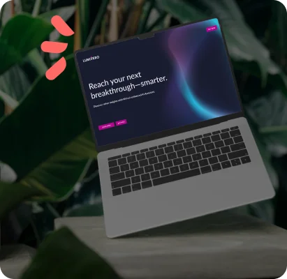
Put your strongest content where users are guaranteed to see it: the top third of the page. That’s your homepage penthouse—treat it like prime real estate.
Pro tip: Use a heatmap or scroll tracking tool like Hotjar or Microsoft Clarity to see where users drop off. Shift your key content up based on actual behavior, not assumptions.
Shameless example: check out our homepage! We don’t make you dig. A clean headline, sharp subhead and bold CTA hit you at first glance—just enough to leave readers wanting more.
5. Cut the clutter and simplify your layout
A crowded site overwhelms users. When everything is shouting, nothing gets heard. Pages packed with competing CTAs, dense copy and random visuals make your audience work too hard—and with this generation, nobody’s got time for that.
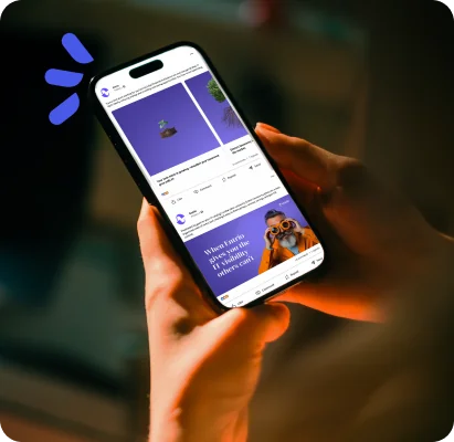
Stock photos are one of the biggest offenders. Generic images erode trust and make your brand feel bland. Instead, use real team photos, product shots or branded illustrations to create a more authentic, memorable experience.
A clean, focused layout guides users to what matters most. We recommend one primary action per page, plenty of white space and a visual hierarchy that leads the eye. The goal? Less chaos, more conversions.
Pro tip: Stick to one primary CTA per page. Secondary links are fine, but make sure users always know the next best step. Ditch anything that doesn’t support the page’s goal.
6. Optimize for mobile (no, seriously)
If it pinches, zooms or breaks, you’re bleeding bounce rates. Over 50% of web traffic is mobile, but too many sites still treat it like an afterthought. Slow load times, clunky tap targets and cramped layouts frustrate users and kill conversions. Design for mobile first, not mobile also.
The same goes for your forms. Long, tedious forms are even more painful on mobile. Ask only what you need; shorter = smarter.
Pro tip: Try multi-step forms or progressive profiling to ease friction and capture quality data without scaring people off. In addition, during QA, test your site on actual devices (not just browser previews) to catch real-world issues that simulators miss.
Check out some gorgeous examples of mobile design on Swype.
Don’t just look good—be useful
You only get one shot at a first impression, and if your site frustrates users? They’re gone. A killer user experience, built on clear content, bold visuals and compelling calls to action, keeps visitors engaged and builds trust fast.
But a beautiful, high-converting site means nothing if no one sees it. Want to show up when your future customers are Googling solutions? Make sure your site isn’t just usable—it’s searchable.
Want more tips on improving your website? Check out these 6 habits hurting your website SEO.
Subscribe to our newsletter
Curated content, news articles, team updates and more.